Machine Learning A-Z: Hands-On Python & R in Data Science (Udemy.com)
Machine Learning , Python, Advanced Data Visualization, R Programming, Linear Regression, Decision Trees, NumPy, Pandas
 What you will learn
nan
 Quality Score
Content Quality
/
Video Quality
/
Qualified Instructor
/
Course Pace
/
Course Depth & Coverage
/
Overall Score : 0 / 100
 Live Chat with CourseDuck's Co-Founder for Help
Need help deciding on a other course? Or looking for more detail on 's Machine Learning A-Z: Hands-On Python & R in Data Science? Feel free to chat below.
Join CourseDuck's Online Learning Discord Community
 Course Description
This course teaches big ideas in machine learning like how to build and evaluate predictive models. This course provides an intro to clustering in R from a machine learning perspective.
This online machine learning course is perfect for those who have a solid basis in R and statistics but are complete beginners with machine learning. Youll get your first intro to machine learning.
After learning the true fundamentals of machine learning, you'll experiment with the techniques that are explained in more detail. By the end, you'll be able to learn and build a decision tree and to classify unseen observations with k-Nearest Neighbors.
Also, you'll be acquainted with simple linear regression, multi-linear regression, and k-Nearest Neighbors regression.
This course teaches the big ideas in machine learning: how to build and evaluate predictive models, how to tune them for optimal performance, how to preprocess data for better results, and much more.
At the end of this course, our machine learning and data science video tutorials, youll have a great understanding of all the main principles.
Details of the course:
Module 01: Basics of R toolIn this video, we are going to install r programming with rstudio in Windows Platform.
Lab 01 R Installation and ConceptsIn this lab, we are going to learn about how we can install R Programing in Windows and learn about its several key concepts that are necessary for Programming in R.
Video 2_R Programming ConceptsIn this video, we are going to learn the necessary concepts of RProgramming.
Video 3_R Progrming ComputationsIn this tutorial, we will be learning about several mathematical algorithms and computations.
Lab 02 R Programing ComputationsIn this lab, we are going to understand RData Structures that include - vectors, matrices, arrays, data frames (similar to tables in a relational database), and lists in R Programing Computations.
Video 4_R Data StructuresIn this video, we will discuss R data structures that resemble a table, in which each column contains values of one variable and each row contains one set of values from each column.
Module 02: Basic Data VisualizationIn this video, we will be understanding circular statistical graphics, which is divided into slices to illustrate numerical proportions in a pie chart.
Lab 03 Plotting Pie Chart using R ToolIn this practical demonstration, you will learn how we can plot a pie chart. Also, well learn the representation of values as slices of a circle with different colors in the pie chart using the R tool.
Video_6 Bar ChartsIn this video, we will learn the categorical data with rectangular bars with heights or lengths proportional to the values that they represent in the bar chart.
Lab 04 Plotting Bar Chart using R ToolIn this lab, we are going to learn how we can plot a bar chart that represents data in rectangular bars with a length of the bar that is proportional to the value of the variable using the R tool.
Video_7 Box PlotIn this video, we learn about how we can display the distribution of data in a standardized way in Boxplot.
Lab 05 Making Box Plot using R ToolIn this lab, we will discuss how we can make a box plot which is a measure of how well the data is distributed in a data set and it divides the data set into three quartiles using the R tool.
Video_8 HistogramsIn this video, we are going to learn about the histograms which are the graphs of a distribution of data that is designed to show centering, dispersion (spread), and shape (relative frequency) of the data by using its different functions.
Lab 06 Working on Histograms using R ToolIn this lab, well be working on histograms that represent the frequencies of values of a variable bucketed into ranges where each bar in histogram represents the height of the number of values present in that ranger creates a histogram using hist() function.
Video_9 Line ChartsIn this video, we are going to learn about the line charts which are also known as Line graph that is used to visualize the value of something over time.
Lab 07 Plotting Line Chart using R ToolIn this lab, we will learn how we can plot a line chart which is a graph that connects a series of points by drawing line segments between them, and then these points are ordered in one of their coordinates (usually the x-coordinate) value.
Video_10 Scatter PlotIn this video, we are going to learn about a set of points plotted on a horizontal and vertical axis which is important in statistics because they can show the extent of correlation, if any, between the values of observed quantities or phenomena (called variables) in Scatter plot.
Lab 08 Working on Scatterplot using R ToolIn this lab, we will be working on Scatterplot which shows many points plotted in the Cartesian plane at where each point represents the values of two variables. In this one variable is chosen in the horizontal axis and another in the vertical axis. The simple scatterplot can be created using the plot() function.
Video_11 Case Study Basic Data VisualizationIn this video, we will explore some interesting case studies on basic data visualizations which is useful for getting a basic understanding of what characteristics is happened in different cases of data visualization with its constituent approaches.
Module 03: Advanced Data VisualizationVideo_12 Basic Illustration of ggplot2 PackageIn this video, we will learn about the ggplot2 package which is a system for declaratively creating graphics, based on The Grammar of Graphics at where we provide the data, tell ggplot2 how to map variables to aesthetics, what graphical primitives to use, and it takes care of the details.
Lab 09 Basic Illustration of ggplot2 PackageIn this lab, we are going to perform a basic illustration on the ggplot2 package which includes a popular collection of packages called the tidyverse at where each geom accepts a particular set of mappings using the R tool.
Video_13 FacetingIn this video, we are going to learn about faceting. How we can facet our data with facets by which you can gain an additional way to map the variables.
Lab 10 Facetting using R ToolIn this lab, well be learning about how we can perform faceting by facet the data which creates a matrix of panels defined by row and column faceting variables. facet_wrap() , which wraps a 1d sequence of panels into 2d.
Video_14 Jitterred PlotsIn this video, we are going to learn about Jittering which means adding random noise to a vector of numeric values, which is done in jitter-function by drawing samples from the uniform distribution in jittered plots.
Lab 11 Working on Jiterred Plots using R ToolIn this lab, well be working on jittered plots where we jitter the data and makes the data easy to understand which uses points to graph the values of different variables.
Video_15 Frequency PolygonsIn this video, we will learn how we can represent our data in a graphical form in Frequency Polygon which is used to depict the shape of the data and to depict t

*Some courses are excluded from this sale. Coupon not working? If the link above doesn't drop prices, clear the cookies in your browser and then click this link here.
Also, you may need to apply the coupon code directly on the cart page to get the discount.
 Reviews


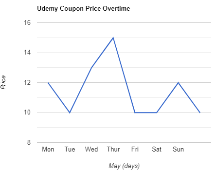
Udemy Coupon Price Tracker