Introduction to Data Analysis Using Excel
This Coursera course was developed by Rice University to introduce users to the analytical powers of Excel software. It is an introductory course that spreads modules over a four-week curriculum. Topics primarily focus on managing data and using analytical tools with a lighter focus on editing and presentation features.
Created by: Sharad Borle
Produced in 2018
 What you will learn
- Intro to Spreadsheets: modules last three hours and explain the basics of data manipulation and arithmetic operations.
- Organizing Data: two hours are spent on "IF" command, "VLOOKUP" and variations on the two commands.
- Filtering, Pivot Tables and Charts: two hours are dedicated to these tools to expand command of data management.
- Advanced Graphing and Charting: two hours of practical experience in utilizing the various graphs built into Excel (such as line graphs, scatter plots and more).
 Quality Score
Content Quality
/
Video Quality
/
Qualified Instructor
/
Course Pace
/
Course Depth & Coverage
/
Overall Score : 100 / 100
 Live Chat with CourseDuck's Co-Founder for Help
Need help deciding on a excel course? Or looking for more detail on Sharad Borle's Introduction to Data Analysis Using Excel? Feel free to chat below.
Join CourseDuck's Online Learning Discord Community
 Course Description
The use of Excel is widespread in the industry. It is a very powerful data analysis tool and almost all big and small businesses use Excel in their day to day functioning. This is an introductory course in the use of Excel and is designed to give you a working knowledge of Excel with the aim of getting to use it for more advance topics in Business Statistics later. The course is designed keeping in mind two kinds of learners - those who have very little functional knowledge of Excel and those who use Excel regularly but at a peripheral level and wish to enhance their skills. The course takes you from basic operations such as reading data into excel using various data formats, organizing and manipulating data, to some of the more advanced functionality of Excel. All along, Excel functionality is introduced using easy to understand examples which are demonstrated in a way that learners can become comfortable in understanding and applying them.To successfully complete course assignments, students must have access to a Windows version of Microsoft Excel 2010 or later. ________________________________________WEEK 1Module 1: Introduction to SpreadsheetsIn this module, you will be introduced to the use of Excel spreadsheets and various basic data functions of Excel.Topics covered include:-Reading data into Excel using various formats-Basic functions in Excel, arithmetic as well as various logical functions-Formatting rows and columns-Using formulas in Excel and their copy and paste using absolute and relative referencing________________________________________WEEK 2Module 2: Spreadsheet Functions to Organize DataThis module introduces various Excel functions to organize and query data. Learners are introduced to the IF, nested IF, VLOOKUP and the HLOOKUP functions of Excel. Topics covered include:-IF and the nested IF functions-VLOOKUP and HLOOKUP-The RANDBETWEEN function________________________________________WEEK 3Module 3: Introduction to Filtering, Pivot Tables, and ChartsThis module introduces various data filtering capabilities of Excel. You'll learn how to set filters in data to selectively access data. A very powerful data summarizing tool, the Pivot Table, is also explained and we begin to introduce the charting feature of Excel.Topics covered include:-VLOOKUP across worksheets-Data filtering in Excel-Use of Pivot tables with categorical as well as numerical data-Introduction to the charting capability of Excel________________________________________WEEK 4Module 4: Advanced Graphing and ChartingThis module explores various advanced graphing and charting techniques available in Excel. Starting with various line, bar and pie charts we introduce pivot charts, scatter plots and histograms. You will get to understand these various charts and get to build them on your own.Topics covered include-Line, Bar and Pie charts-Pivot charts-Scatter plots-Histograms
 Pros
Pros
 Cons
Cons
-
- Streamlined class keeps the focus where promised: on analyzing data, not editing or customizing cells.
- Class is example-driven, making it easier to follow concepts and techniques.
- Coursera courses include lines of communication between students and instructors. Specific questions can be asked and will be answered.
-
- Course is designed from a single version of Excel. Mac users, users in countries outside the United States and users with alternative Excel versions will face hiccups with certain features and instructions.
- While considered a course for beginners, the lessons assume some familiarity with Excel. This course does not spend much time on the most basic operations.
 Instructor Details

- 5.0 Rating
 125 Reviews
Sharad Borle
Sharad is a faculty of Management at the Jones Graduate School of Business at Rice University, Houston, Texas. He holds a Ph.D. from Carnegie Mellon University, and his expertise lies in Business statistics and data analytics. He is a well published academic with publications in top tier quantitative journals. He is passionate about teaching Business statistics and makes difficult concepts easy to understand in a way that learners get confidence in applying them to their particular decision situations.
 Students also recommend
-
Microsoft Excel - Online Tutorial for Beginners (2010)
-
0.0 (0 Reviews)
-
 Provider: Chandoo.org
 Time: 1h 30m
Free
 Reviews
- Video Duration:
 3h
3h - Price: Free 0 Track Price
- Provider: Coursera
- University:
 Rice University
 - Year:
 2018
2018 - Level:
 Beginner
 - Language:
 English
 - Certificate:
 Yes
Yes
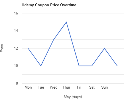
Coursera Coupon Price Tracker