
 Web Development
 Python
 SQL
SQL JavaScript
 Data Science
 Artificial Intelligence
 IT & Software
 IT Certifications
 Hacking
 Arduino
 AWS
AWS 3D Modeling
 Graphic Design
 Photoshop
 Drawing
 Digital Painting
 UX Design
 Business
 Data Analysis
 Communication Skills
 Project Management
 Leadership & Management
 E-Commerce
 Digital Marketing
 Social Media Marketing
 Marketing
 SEO
SEO Google Analytics
 Branding
 Office Productivity
 Excel
Excel Finance & Accounting
 Bitcoin
 Video Editing & Animation
 Photography
 Adobe Premier Pro
 Adobe Lightroom
 Personal Development
 Health & Fitness
 Music
Music Guitar
 Teaching & Academics
 Language Learning
 Engineering
 Lifestyle
Design Principles for Effective Dashboard Design (Udemy.com)
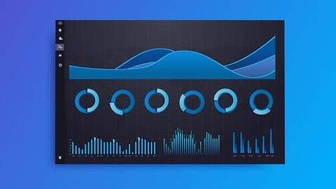
Increase engagement by understanding the psychology of information retrieval & 12 actionable improvements for dashboards
Created by: Annabel Lyle
Last updated November 2018
 What you will learn
- Effectively Design Dashboards for a great User Experience
- Increase usage and engagement of the dashboards you create
- Make insights and data more actionable through dashboards that follow best practice Design Principles
- Understand the basis in the psychology of information retrieval
- Understand Key Design principles of Design Theory
- Ability to Critique and improve the design of an existing dashboard
- Coach others in how to design effective dashboards
- 12 Actionable ways you can improve your dashboards
 Course Description
In this course you will learn how to build more effective dashboards to communicate insights in the most effective and impact way possible by following key Design Principles for User Experience:
You will learn about:
- Why investing time in the Design of your dashboards is so important
- The Psychology of Information Retrieval
- Design Principles (Affordance, Aesthetics, Accessibility & Acceptance)
- 3 Key actionable tips to implement for each Design Principle
- Overall 12 key actionable ways you can improve your existing dashboards and use when designing new ones
This course is aimed at:
- Analysts or users who are creating Dashboards for end users
- Managers of Analysts
- Users who work with Analysts who create Dashboards
It doesn't matter which dashboard or Business Intelligence tool you are using to create your dashboards - this course will equip you with universal design principles that can be applied with any tool.

 Udemy Discount
The discount is applied through our link. Open the course from here and Udemy's current promotional price is applied at checkout on most courses, no code to type.
Some courses are excluded from Udemy's promotions. If the price does not drop, clear your browser cookies and use the button again.
Instructor Details

- 4.2 Rating
 3,325 Reviews
Annabel Lyle
My name is Annabel and I have over 5 years of experience as a Data Analyst within Marketing and Product Teams. I have also mentored and taught individuals and teams how to get the most out of a range of data visualisation tools, to ensure they have the greatest impact. My expertise is in storytelling with data, data visualisation and data analysis. Key tools that I teach and work with include Data Studio, Google Analytics, Google Tag Manager and R Studio.
 More courses by Annabel Lyle

Learn SQL for Data Analysis with Google Big Query (2019)
4.3 (3,834 Reviews)
 Provider: Udemy
 Time: 2h
$49.99

Build Insightful Dashboards with Google Data Studio (2019)
4.0 (928 Reviews)
- Provider: Udemy
- Time: 2.4h
$11.99

Google Data Studio - Master the Advanced Concepts (2020)
4.1 (350 Reviews)
- Provider: Udemy
- Time: 2.2h
$49.99
More Data Analysis courses


Complete neural signal processing and analysis: Zero to hero (2026)
4.8 (2,013 Reviews)
- Provider: Udemy
- Time: 46.9h
$12.99
Excel for Business Analysts Online Course (2023)
4.8 (636 Reviews)
- Provider: Udemy
- Time: 9.3h
$74.99

Alteryx Designer Advanced Certification Mega Bundle (2023)
4.8 (468 Reviews)
- Provider: Udemy
- Time: 16.9h
$69.99


The Complete SQL Bootcamp : From Beginner to Advanced (2026)
4.8 (130 Reviews)
- Provider: Udemy
- Time: 14.2h
$19.99
 Reviews

By Uday Choudhary on 10/11/2025
This is an Excellent course in explaining design principles for dashboard design and delivers the promised results. 5 out of 5 stars. While there are no hands-on exercises, I am sure the author's other courses cover them as per the learner's requirement. This short duration of the course is well worth time spent for someone who is new to design but found the course simple and accessible. Thank you for this course, Annabel Lyle.
By Ana Martins on 6/2/2025
Taking this course was a step toward deepening my understanding of my role. I wanted to strengthen my theoretical knowledge—especially around the psychology of information retrieval. It’s helped shift my approach to designing with greater intention, focusing on how users think and interact with dashboards. Simplifying complex data has often felt overwhelming, but I now feel better equipped to create with clarity and purpose.
By Anonymized User on 5/8/2025
I neither liked it nor disliked it. I feel that it's a good summary, but I would prefer to see something less theoretical and more practical - also more advanced dashboards where there might be multiple dashboards and clients can toggle to different ones, or if clients wants to 'customise' dashboards to their needs, how do we go about addressing all these things. It didn't really answer the questions that I had in mind. Nonetheless, there are still some takeaways for me.
By Nicola Dowman on 4/17/2024
I enjoyed the course and learned from it but it would have been useful to have had a handout with the key points - specially the different chart options. One lecture had a blank screen so that needs to be fixed and the last lecture mentions a next lecture and addition links but there is nothing there
By Anonymized User on 7/21/2023
Good, if very basic, principles, but I wouldn't expect a lot of depth from a course this short. Also, given the date of the recording (2018), the examples all look fairly dated now, and some of the chart types offered as suggestions are actually not the best choices for data visualizations (area charts instead of simple line charts, for example). Still, just scrolling through the contents of the course works as a good checklist of things to consider in dashboard design.
By Mark Jonathan Maiztegui on 7/14/2023
No workbook and/or PowerPoint summarization given by the course provider. Although the content was good, I really wish the author gave some downloadable material where we could review the concepts given here so i don't have to (re)watch another video just to determine what type of chart I must use for the data I am using.
By Anonymized User on 3/29/2023
I recently completed a course on designing dashboards, and I must say I was thoroughly impressed by the quality of information provided. The course covered all the important aspects of dashboard design, including key considerations to keep in mind and useful tips to ensure a visually appealing and functional dashboard. I found the content to be very engaging and easy to follow, and the examples used were relevant and helpful. Overall, I highly recommend this course to anyone who wants to learn about dashboard design, whether you're a beginner or an experienced professional.
By Alfonso Cervantes Alonso on 7/7/2022
As a beginner in ui/ux design this course has very valuable information for me. I will come back later for a refreshment in some dashboards design basics. I wouldn't recommend this one to someone who's already done some digital product design work. However if it's just a refreshment you'd like to have, go ahead, the examples shown are very clear and easy to digest. I'm already using the principles I've seen here in a project I'm working on as I write this review. So, it's quite useful.
By Ryan van Donk on 5/15/2022
Duidelijke cursus over de belangrijkste principes die van toepassing zijn op het effectief ontwerpen van dashboards. Deze cursus spreekt mij erg aan, omdat ik er achter ben gekomen, dat dit in de praktijk vaak over het over hoofd wordt gezien, terwijl het van groot belang is bij het creëren van visuals / reports / dashboards die ook in de daadwerkelijke behoefte voorzien van de gebruiker.
By Cynthia Oakley on 12/29/2020
This course is the missing piece I needed to round out my company's training path in data analytics. It's a nice short intro-level course that addresses the unique data viz challenges that come up in dashboard design, including some often overlooked aspects of the process like end-user enablement and adoption. Most importantly, it is tool-agnostic, so the principles can be applied using any data visualization tool. Despite the ubiquity of technology-specific training these days, I still often see dashboards created by people who know their tool's features quite well but make basic design mistakes because they haven't been taught the fundamentals of chart type selection and usability. This course is one step toward fixing that, at least within my own sphere of influence. The instructor's voice is clear and pleasant, and the topics are organized well. There's only so much of this very big field that you can cover in an hour, but she is able to touch upon a surprising array of topics with no added fluff. I even learned some new things, which I didn't expect as someone who also teaches on data viz. In my opinion, this course should be much closer to 5 stars overall.
 Quality Score
No CourseDuck member has rated this course yet. Taken it? Give each part a thumbs up or down.
Overall Score : 84 / 100
- Video Duration:
 54 mins
 - Price: $10.99
- Provider: Udemy
- Updated:
 November 2018
 - Level:
 All Levels
 - Language:
 English
 - Certificate:
 Yes
Yes
30-day money-back guarantee on most paid courses
Udemy Coupon Price Tracker
