

Data Visualization with Python for Beginners (Udemy.com)
Learn how to start visualizing all your data directly in your code
Created by: Maximilian Schallwig
Produced in 2017
 What you will learn
- Make line plots in Python
- Make scatter plots in Python
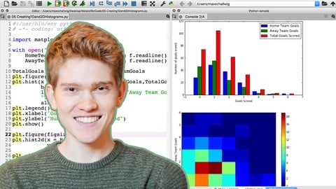
- Make 1-dimensional and 2-dimensional histogram plots
- Customize your plots by adding colour and changing line styles
- Customize your axis by changing the tick labels
- Add custom titles and labels to your plots
- Add custom text to your plots
- Adjust the size of your figures
- Add a legend to your plots
- Be able to save your figures in a desired format to your computer
- Change the scale of the axis to better graph logarithmic data
 Quality Score
Overall Score : 86 / 100
 Course Description
Matplotlib provides many great plotting opportunities and methods for data visualization, and in this course we will be looking at some introductory methods for getting started with creating plots in Python.
Once we have a starting point for plotting data we can easily expand our knowledge to different areas to make sure we can best represent all of our data. Who this course is for:
Anyone interested in analyzing dataAnyone who needs to visualize dataPeople who want to incorporate data visualization into their codeAnyone who is interested in expanding their Python knowledge

 Instructor Details

- 4.3 Rating
 96 Reviews
Maximilian Schallwig
I've worked for over two years in physics research and mathematical analysis. I participated in two international physics competitions, where my two teammates and I won silver and gold. My thesis was in the field of Quantum Biology, focusing on analyzing the behavior of excitons at room temperature with electronic interaction.
Due to my affinity for math and statistics from my studies in physics, I tend towards data mining, processing, and analysis, which are also the things that I find most exciting.
I enjoy learning new methods and developing my skills, and am constantly studying new literature and documentation to find exciting material that can be applied in the field of data analysis.
If you want to keep up with what else I'm doing in the fields of programming, data, and data science, you can check me out at codingwithmax.
 Reviews

- Video Duration:
 1.5h
1.5h - Price: 11.99 Track Price 11.99 Track Price
- Provider:
 Udemy
Udemy - Year:
 2017
2017 - Language:
 English
 - Certificate:
 Yes
Yes

30-Day Money-Back Guarantee
Udemy Coupon Price Tracker
