
 Web Development
 Python
 SQL
SQL JavaScript
 Data Science
 Artificial Intelligence
 IT & Software
 IT Certifications
 Hacking
 Arduino
 AWS
AWS 3D Modeling
 Graphic Design
 Photoshop
 Drawing
 Digital Painting
 UX Design
 Business
 Data Analysis
 Communication Skills
 Project Management
 Leadership & Management
 E-Commerce
 Digital Marketing
 Social Media Marketing
 Marketing
 SEO
SEO Google Analytics
 Branding
 Office Productivity
 Excel
Excel Finance & Accounting
 Bitcoin
 Video Editing & Animation
 Photography
 Adobe Premier Pro
 Adobe Lightroom
 Personal Development
 Health & Fitness
 Music
Music Guitar
 Teaching & Academics
 Language Learning
 Engineering
 Lifestyle
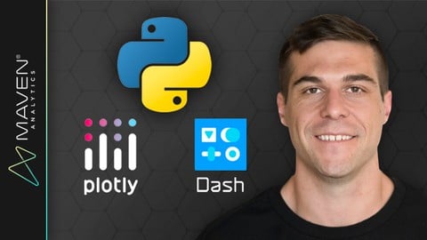
Python Data Visualization: Dashboards with Plotly & Dash (Udemy.com)
Build Python visuals, dashboards and web apps using Plotly & Dash, w/ a top Python data science & analytics instructor!
Created by: Maven Analytics
Last updated June 2026
 What you will learn
- Master Python's Plotly & Dash libraries for building interactive visuals, dashboards and web apps
- Design and format Plotly visuals, including line charts, bar charts, scatter plots, histograms, maps and more
- Learn how to add interactive elements like dropdown menus, checklists, sliders and date pickers
- Apply HTML and markdown components to design custom dashboard layouts and themes
- Practice building and deploying your own custom web applications with Python & Dash
- Explore advanced topics like conditional and chained callbacks, cross-filtering and real-time automation
 Course Description
This is a hands-on, project-based course designed to help you master Plotly and Dash, two of Python's most popular packages for creating interactive visuals, dashboards and web applications.
We'll start by introducing the core components of a Dash application, review basic front-end and back-end elements, and demonstrate how to tie everything together to create a simple, interactive web app.
From there we'll explore a variety of Plotly data analysis and visualization tools, including line charts, scatterplots, histograms and maps. We'll apply basic formatting options like layouts and axis labels, add context to our visuals using annotations and reference lines, then bring our data to life with interactive elements like dropdown menus, checklists, sliders, date pickers, and more.
Last but not least we'll use Dash to build and customize a web-based dashboard, using tools like markdown, HTML components & styles, themes, grids, tabs, and more. We'll also introduce some advanced topics like data tables, conditional and chained callbacks, cross-filters, and app deployment options.
Throughout the course you'll play the role of a Data Analyst for Maveluxe Travel, a high-end agency that helps customers find flights and resorts based on their travel preferences. Your task? Use Python to create interactive visuals and dashboards to help Maveluxe's travel agents best support their customers.
COURSE OUTLINE:
Intro to Plotly & Dash
Introduce the Plotly & Dash libraries, and cover the key steps and components for creating a basic Dash application with interactive Plotly visuals
Plotly Figures & Chart Types
Dive into the Plotly library for data analysis and visualization, and use it to build and customize several chart types, including line charts, bar charts, pie charts, scatterplots, maps and histograms
Interactive Elements
Get comfortable embedding Dash’s interactive elements into your application, and using them to manipulate Plotly visualizations
MID-COURSE PROJECT
Build two working Dash applications to help the Maveluxe team visualize and explore data from ski resorts across the US and Canada
Dashboard Layouts
Learn how to organize your visualizations and interactive components into a visually appealing and logical dashboard structure
Advanced Functionality
Take your applications to the next level by learning how to update your application with real-time data, develop chained-callback functions, and more!
FINAL PROJECT
Build a multi-tab dashboard to expand your mid-course project to ski resorts around the world, leveraging grid layouts, interactive elements and visuals, and advanced callback functions
Join today and get immediate, lifetime access to the following:
8.5 hours of high-quality video
Python Plotly & Dash PDF ebook (180+ pages)
Downloadable project files & solutions
Expert support and Q&A forum
30-day Udemy satisfaction guarantee
If you're a data analyst, data scientist or business intelligence professional looking to add Plotly & Dash to your Python skill set, this is the course for you!
Happy learning!
-Chris Bruehl (Python Expert & Lead Python Instructor, Maven Analytics)
__________
Looking for our full business intelligence stack? Search for "Maven Analytics" to browse our full course library, including Excel, Power BI, MySQL, Tableau and Machine Learning courses!
See why our courses are among the TOP-RATED on Udemy:
"Some of the BEST courses I've ever taken. I've studied several programming languages, Excel, VBA and web dev, and Maven is among the very best I've seen!" Russ C.
"This is my fourth course from Maven Analytics and my fourth 5-star review, so I'm running out of things to say. I wish Maven was in my life earlier!" Tatsiana M.
"Maven Analytics should become the new standard for all courses taught on Udemy!" Jonah M.

 Udemy Discount
The discount is applied through our link. Open the course from here and Udemy's current promotional price is applied at checkout on most courses, no code to type.
Some courses are excluded from Udemy's promotions. If the price does not drop, clear your browser cookies and use the button again.
Instructor Details

- 4.6 Rating
 726 Reviews
Maven Analytics
Maven Analytics is an award-winning platform where individuals and teams build new skills, showcase work, and connect with experts around the world.
We've helped more than 2,000,000 learners around the world build job-ready data & AI skills, master tools like Excel, SQL, Power BI, Tableau and Python, and build the foundation for successful careers.
Start learning for free!
 More courses by Maven Analytics

Microsoft Power BI Desktop for Business Intelligence (2026)
4.6 (196,667 Reviews)
 Provider: Udemy
 Time: 17h
$139.99
Microsoft Excel: Advanced Excel Formulas & Functions (2026)
4.6 (120,271 Reviews)
- Provider: Udemy
- Time: 9.4h
$199.99
Microsoft Excel: Data Analysis with Excel Pivot Tables (2026)
4.7 (78,818 Reviews)
- Provider: Udemy
- Time: 6.8h
$199.99
Microsoft Excel: Data Visualization w/ Excel Charts & Graphs (2026)
4.6 (61,560 Reviews)
- Provider: Udemy
- Time: 4.6h
$199.99
Microsoft Excel: Business Intelligence w/ Power Query & DAX (2026)
4.7 (29,351 Reviews)
- Provider: Udemy
- Time: 7.3h
$17.99
Microsoft Power BI Desktop: Advanced DAX for Data Analysis (2026)
4.7 (15,632 Reviews)
- Provider: Udemy
- Time: 11.5h
$139.99
More Data Science courses




Master statistics & machine learning: intuition, math, code (2026)
4.9 (3,077 Reviews)
- Provider: Udemy
- Time: 38.3h
$124.99

 Reviews

By Miguelangel Leon Mayuare on 8/3/2026
What is shown is shown well. It is very basic but is nothing more than the plotly dash guides/tutorials on its own website. I was expecting more advanced approach, cloud deployment, ML apps, caching server side and browser side, an example of data connection (like an API, Bigjquery, etc) where caching is applied. Nevertheless, the basics are good.
By Mike McFerren on 8/5/2025
I found the explanations clear and easy to follow. I think the course did a nice job of providing enough detail to allow me to make charts and design layouts for most ordinary cases. I feel that I have enough of a foundation to dive into the documentation to do more advanced work as the need arises. I would definitely take another course from this instructor.
By Stefan on 5/17/2025
I was looking for a quick yet comprehensive course that would show me how to use Plotly and Dash to build a user interface. This course is exactly that: it's not too long, but it teaches you everything you need to know to start your own project. It's definitely worth the money!
By David Refaat on 1/31/2025
Really love the idea of combining both web development with Data Analysis or Data Science and i wish there was a Model Deployment Demo or a Project included , love open source and what custom Dashboards can provide and i am sure with more training on Projects that would be easy , also wish there was an authentication demo if you want to provide logins for your users , but overall i am pretty satsified with the course and what it provided 5 Stars, Thanks Chris and Maven Analytics Team , waiting for more courses from you
By Ran M on 12/5/2024
Good course, very practical. This course is about visualization, not data handling or pandas. While not super critical, you can get more out of this course if you feel comfortable coding in Python and using Pandas. The exercises were helpful and the final project really ties things together. I asked one question during the course, and it was answered quickly and professionally. Bottom line - I recommend this course to anyone who wants to learn Dash.
By Muhammad Junaidi Bin Arip on 3/3/2024
Instructor was very knowledgeable and able to get to the point. Audio clarity could be improved as i noticed instances where speeches were not so clear. In a nutshell, highly recommended if you want to learn more about Plotly and Dash!
By Marc Ritzl on 12/20/2023
Es wäre besser ein Miniprojekt durchzuziehen. Das hin und her gespringe zu verschiedenen Miniprojekten ist sehr verwirrend wenn man das zum ersten Mal macht. Es wäre auch toll, wenn jeweils der gesamt Code gezeigt würde und nicht nur Ausschnitte.
By Anonymized User on 10/4/2023
This is the 4th course of the Python series. I never really thought of building any Dashboards myself. To me this was the most challenging course as the callback functions with outputs and inputs are not very straight forward to understand. But it gave me a solid understanding what's happening behind the scenes on any webpage. It made me actually see how should I think in terms of creating the dash board. And creating the visuals is just the mechanic part of everything. The more challenging thing is to trying to understand what do you want to show your user and how to keep it simple. There is a big temptation to start adding all slicers, tabs, dropdown lists, checkbox into your dashboard but you should really stay focused on the main purpose - tell a story with your data. Also this encourages me learning more css and htlml to add more tools for further dashboards projects. I really enjoyed this course though didn't expect much in the beginning.
By Khandoker Tanjim Ahammad on 7/8/2023
I was really struggling with building interactive dashboard using Plotly-Dash. This course is really helpful to understand how Dash app works and how we can visualize our data in a more efficient way. Thanks for creating this course.
By Josh Bemis on 5/25/2023
This was an awesome course. I went into it wanting to learn how to work with Dash and Plotly to create web applications (surprise, considering the course name) and I was taught everything I needed to know to do exactly that. I usually take my own notes and write out the code I'm watching people work with so I learn better, but the notebooks included in the course materials have everything already put together in a great format. If you like watching and running the code later, you'll have everything you need. The final course project was a great exercise for me and I retained a lot more than I thought I had.
 Quality Score
No CourseDuck member has rated this course yet. Taken it? Give each part a thumbs up or down.
Overall Score : 92 / 100
- Video Duration:
 8.6h
8.6h - Price: $79.99
- Provider: Udemy
- Updated:
 June 2026
 - Level:
 All Levels
 - Language:
 English
 - Certificate:
 Yes
Yes
30-day money-back guarantee on most paid courses
Udemy Coupon Price Tracker
