
 Web Development
 Python
 SQL
SQL Data Science
 JavaScript
 Artificial Intelligence
 IT & Software
 IT Certifications
 Hacking
 Arduino
 AWS
AWS DevOps
 3D Modeling
 Graphic Design
 Photoshop
 Drawing
 Digital Painting
 UX Design
 Business
 Data Analysis
 Communication Skills
 Leadership & Management
 Project Management
 Human Resources
 Digital Marketing
 Social Media Marketing
 Marketing
 SEO
SEO Google Analytics
 Branding
 Excel
Excel Office Productivity
 SAP
SAP PowerPoint
 Microsoft Access
 SharePoint
 Finance & Accounting
 Trading & Investing
 Accounting
 Bitcoin
 Personal Finance
 Video Editing & Animation
 Photography
 Adobe Premier Pro
 Adobe Lightroom
 Personal Development
 Productivity
 Career Development
 Life Coaching
 Health & Fitness
 Meditation & Mindfulness
 Yoga
Yoga Music
Music Music Production
 Guitar
 Piano
Piano Singing
 Language Learning
 Teaching & Academics
 Engineering
 Math
Math Lifestyle
Microsoft Power BI: The Art of Designing Incredible Tools (Udemy.com)
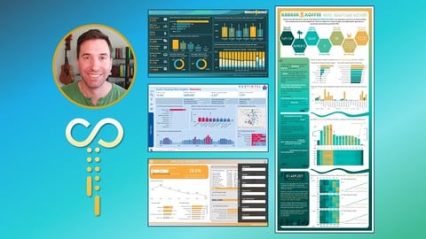
Learn how art, psychology, design, data, and business acumen combine to create incredible Microsoft Power BI tools.
Created by: Sean Chandler
Last updated May 2022
 What you will learn
- Master the principles of Gestalt design and learn how to apply smart design techniques to business intelligence reports, as well as common mistakes to avoid.
- Learn how to apply color strategically in your tools to ensure maximum readability and guide your users through the most important insights in your tools.
- Learn how to find the story and dissect datasets in order to create compelling narratives that propel business users towards insights and, ultimately, action.
- Use common business tools and built-in Power BI functionality to engineer design and navigation experiences for your users that will immerse them in your tool.
- Apply common web design techniques to business intelligence tools, transforming your creations from semi-interactive reports into complex data-driven web tools.
- Learn how to conceptualize and deliver a front-end design experience from start to finish, using a free UFO sightings dataset.
 Course Description
Microsoft Power BI: The Art of Designing Incredible Tools is a course focused on what it means to design beautiful reports and dashboards. Are you a Power BI builder struggling with how to design tools that look as amazing on the front-end as they are in the back-end? You're in the right place! Where other wonderful courses teach the technical aspects of Power BI that help aspiring BI engineers wrangle data, transform it, visualize it, and publish tools across their company, this course is focused specifically on the art of designing tools that look amazing, tell meaningful data stories, and deliver a wonderful online user experience.
In this course, learn about some foundational design techniques based in Gestalt psychology, learn how to refine your use of color to make the most important insights "pop", learn how data storytelling is very different from traditional narrative storytelling, and learn about the many things that BI tools and video games have in common when it comes to user experience. In 15 hours, you're not guaranteed to learn everything there is to learn about design and data storytelling, but you will receive the exposure necessary to elevate your BI tools from collections of data visuals into gorgeous "tools" that marry data visualization, design, color, text, imagery, and other stylistic elements in order to invite your users into your creations.

 Udemy Discount
The discount is applied through our link. Open the course from here and Udemy's current promotional price is applied at checkout on most courses, no code to type.
Some courses are excluded from Udemy's promotions. If the price does not drop, clear your browser cookies and use the button again.
Instructor Details

- 4.7 Rating
 959 Reviews
Sean Chandler
Sean Chandler has been working professionally in business intelligence since 2014, specializing in creating solutions of all shapes and sizes on the Microsoft Power Platform. Sean started his Microsoft Power BI journey working for an industrial manufacturer of ceiling fans called Big Ass Fans in Lexington, Kentucky before transitioning to Humana, one of the US's largest healthcare and insurance companies in 2019, where he has worked as a Senior BI Engineer, a Business Intelligence Lead, and now serves as Director of Business Intelligence for the company's Home Health division.
As a BI professional, Sean has delivered hundreds of Power BI projects ranging from small ad hoc solutions to enormous tools integrating hundreds of millions of rows of complex business data. He has won multiple awards for his BI work and has even been featured as a presenter on the Microsoft Mechanics web series and the Maven Analytics podcast Mavens of Data. Over the past several years, his Power BI expertise has allowed him to teach a variety of courses on designing effective BI solutions and has provided instruction on data visualization and design to thousands of students through companies like Udacity and Udemy, as well as on his Sweatpants BI YouTube channel.
 More courses by Sean Chandler
More Power BI courses

15 days of Power BI - Complete Microsoft Power BI Bootcamp (2026)
4.7 (23,152 Reviews)
 Provider: Udemy
 Time: 15.8h
$124.99
Microsoft Power BI Desktop: Advanced DAX for Data Analysis (2026)
4.7 (15,632 Reviews)
- Provider: Udemy
- Time: 11.5h
$139.99
Microsoft Power BI - Up & Running With Power BI Service (2026)
4.7 (9,669 Reviews)
- Provider: Udemy
- Time: 5.9h
$24.99

Microsoft Power BI - The Complete Masterclass (2026)
4.7 (4,748 Reviews)
- Provider: Udemy
- Time: 17.2h
$139.99
![[NEW] PL-300: Microsoft Power BI Data Analyst Associate 2026](/programming/power-bi/images/6603795_bc57_2.jpg?v=1791193099)
[NEW] PL-300: Microsoft Power BI Data Analyst Associate 2026
4.7 (1,265 Reviews)
- Provider: Udemy
- Time: 26.9h
$10.99

Microsoft Power BI Desktop: DAX, AI and Data Modelling (2026)
4.7 (1,018 Reviews)
- Provider: Udemy
- Time: 12.8h
$10.99
 Reviews

By SHERRY W on 9/2/2026
It was very good! Lots of new tools that I am so excited to try out! (I last used PBI almost 10 years ago and have now been hired to a new job specifically to move all their reporting over to PBI) Good visuals and almost flawless editing to make sure it all appeared smooth and connected. Just overall fantastic job. And the PBI reports you built were amazing!!!
By Eleazar Espinoza on 3/27/2024
Could have shorten the lessons to much more digestible and have less filler in the videos. Had to double the video speed to make it easier to get to the actual meat of the lesson.
By Gabriele Nunzio Maugeri on 3/13/2024
Sean has done an exceptional job with his course, "Microsoft Power BI: The Art of Designing Incredible Tools". This course, which covers PowerBI, Design Principles, and Gestalt, is packed with real-world examples. It offers deep insights and practical knowledge that is easy to understand and apply. Sean's passion for teaching is evident, making this course a must for anyone looking to master these topics. A truly fantastic resource!
By Mohamed Salih on 11/21/2023
This course is awesome! Amazing content that exceeded my expectations. It took my reports (and my approach to BI) to a whole other dimension. Highly recommended. Sean is a consummate professional. Thank you for this tremendous and sincere effort. Can't wait for your next course. One note is that this course assumes basic knowledge of Power BI and focuses on design. It's not suitable as an intro to Power BI. Otherwise, it's brilliant.
By Anonymized User on 9/14/2023
The course had tremendous impact points and would definitely improve my PowerBI UI/UX skills. Reason why i did not give full 5 starts is because there were many demos where designing was done offline which i would have liked to see in the videos. Apart from that Sean has done a great job with this course and is very clear on what he is talking about.
By Tomas Kavicky on 6/16/2023
I had a lot of PBI courses, but this was different (in good way). It was not purely set up on ,,powerbi,, as a tool, but has contained several good tips/tricks and additional stuff that will help you to see the BI from different side of the road. I do recommend to take this course to everyone who means to add ,,more,, into the storytelling, UI UX etc.
By Vamshi Munukuntla on 6/5/2023
This is really great course. Sean Chandler teaches you how to organize the data and how to keep the end user in mind while designing the reports, and his top ten list in every section is something I will be reviewing every time a build a new report. Thanks, Sean for creating this wonderful course. Looking forward to taking more courses from you and learning.
By Karthik Arumugam on 5/10/2023
A fantastic course! Besides learning about some cool tricks with Power BI (the main tool used in this course), I also learnt a lot about visualization and story telling. I actually incorporated a lot of the learnings into my latest dashboard and got very good feedback from the users and stakeholders in the company. Thanks Sean for this amazing course!
By Eric Tremblay on 3/7/2023
I enjoyed this class, it's all about design and improving Power BI visually. It's not about DAX or anything technical. It's purely cosmetics UI best practices. How to make your reports more visually appealing and user friendly. I can see that Sean worked very hard on this class and it shows. I recommend this class if you want to polish your reports and make them look and be more useful for your users.
By Andrew Hubbard on 8/18/2022
I found this course to be really useful and wanted to take what I’d learned and put it into practice, so I stopped at various points and revamped reports with the knowledge I gained. The difference in my reports using the points covered by Sean definitely improved my reports and made them better to use. He explained the topics well. I found his presentations engaging. He also has provided the presentations used as downloadable resources, so I have them at hand to review whenever I need to. I definitely recommend this course to those who want to take their reports to the next level.
 Quality Score
No CourseDuck member has rated this course yet. Taken it? Give each part a thumbs up or down.
Overall Score : 94 / 100
- Video Duration:
 14.8h
14.8h - Price: $10.99
- Provider: Udemy
- Updated:
 May 2022
 - Level:
 Beginner
 - Language:
 English
 - Certificate:
 Yes
Yes
30-day money-back guarantee on most paid courses
Udemy Coupon Price Tracker
